Select a site alphabetically from the choices shown in the box below. Alternatively, browse sculptural examples using the Forward/Back buttons.
Chapters for this volume, along with copies of original in-text images, are available here.


Object type: Plain font with inscription
Measurements:
H. 67 cm (26.5 in); internally 36 cm (14.25 in)
Diam. at top 88 cm (34.5 in); internally 66 cm (26 in)
Circumference at top c. 278 cm (109.5 in)
H. of rim 8 > 7.5 cm (c. 3 in); D. of rim 11 cm (4.25 in)
Diam. of hole 20.5 > 10 cm (8 > 4 in)
Stone type: Pale yellowish-grey (10YR 8/2) oolite, very even-grained, with ooliths of 0.4 to 0.5mm diameter in a calcite matrix; a few thin shelly streaks aligned vertically, i.e. parallel to the sides of the font bowl. Bath stone, Chalfield Oolite Formation, Great Oolite Group, Middle Jurassic
Plate numbers in printed volume: Pls. 472-84
Corpus volume reference: Vol 7 p. 224-8
(There may be more views or larger images available for this item. Click on the thumbnail image to view.)
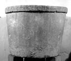
The font is cone-shaped with a squared overhanging rim on which a Latin inscription is framed between two incised lines. There is another encircling incised line about 20 cm from the base, and above that the surface is highly polished, while below the line the surface is rougher. In the interior there is the seating for a lid, and a crudely gouged, tapering hole in the centre of the base. The base has been set into the bowl of the font with lead, at the same level as the incised external line, and might be a reused millstone.
Inscription The principal feature of the font is an inscription which runs around the vertical surface of the projecting rim at the top of the bowl (Okasha 1983, 96–7, 112, pl. IXa). The rim is 7.5–8 cm high and the inscription occupies a band between two incised framing lines set 4.6–4.8 cm apart. The height of individual letters varies between about 3.1 and 3.5 cm. Although some letters are damaged, the inscription seems to be complete as it now stands. There are no traces of lettering on the extensively damaged section of the rim (roughly 42 cm in length) between what remains of the probable final letter of the inscription and the introductory cross. This side of the font is now positioned close to the internal west wall of the nave of the church and, where it is closest to the wall, is hard to examine. The final, damaged letter (N) can, however, be seen with the aid of a mirror (Ill. 483). Much of this section of the rim has been damaged but it can be seen that the framing lines continued for some way before and after the inscription. The lower framing line can be traced for about 7 cm to the right of the final letter, at which point it may turn upwards to enclose a panel but this is uncertain. Buck (1950, 462) claimed that that the lettering was re-cut after the rediscovery of the font but Okasha (1983, 97) is right to point out that there are now no obvious signs of recutting. One possible exception, however, is the final letter (N), which is in a very damaged area. The strokes of this letter seem to have been partially re-cut or deepened. The verticals are not quite perpendicular and the effect is a little crude. Apart from this, the lettering is generally well preserved and clearly legible in spite of some wear and areas of damage. The inscription can be transcribed as follows:
+SICVTC[E]RVV[SD]ESI[DER]AT[ADFON]TE[S]AQVARV[M:ITADE]SI[D]E[RA . ]ANIMAM[EAAD]T[ED]S:AME[N]
The text is in Latin and the reading is clear:
+ SICVT CERVVS DESIDERAT AD FONTES AQVARVM [:] ITA DESIDERAT ANIMA MEA AD TE D(EV)S : AMEN
The text corresponds to Psalm 41. 2 in the 'Roman' translation (Weber 1953, 91), with the addition of a concluding Amen ('As the hart panteth after the fountains of water; so my soul panteth after thee, O God. [1] Amen.'). The 'Gallican' version has Quemadmodum for the 'Roman' Sicut.
The text opens with an initial cross in the form of a Greek cross. A clear mid-line point was used to separate off the psalm verse from the final Amen. Some form of punctuation seems also to have marked the end of the first phrase ending in aquarum. The text is unabbreviated apart from the use of the standard nomen sacrum contraction DS for D(EV)S. There is no trace over these two letters of the bar normally used to mark abbreviations.
The lettering is neatly but not rigidly set between the upper and lower framing lines and individual letters vary a little in height. The letters are lightly incised and are cut with a V-section. Individual strokes terminate in small triangular serifs and show little variation in breadth or depth. The layout of the text on the font shows some variation in the amount of space allowed for each letter. The final words are in more generously spaced lettering than that seen elsewhere in the inscription (about 44 cm for ten letters as opposed, for example, to the previous ten letters or the first ten letters, which occupy 36 and 33 cm respectively).
The letters conform to standard forms rather than making a virtue of variation. A, E, F, I, N, O, T and V are the normal 'Roman' capital forms. Three other letters are variants of the 'Roman' capital. M has outer strokes that are vertical (rather than splayed) and a shallow central 'V', the angle of which reaches no further than about half-way down the letter. The tail of the Q is a sinuous stroke that is half inside and half outside the bowl of the letter (rather than, as usual, a straight or sinuous stroke entirely outside the bowl). In the R the bow is open (rather than fully closed) at the bottom. C and S are angular versions of the 'Roman' capital. D is a form of the uncial with an open bowl and the upper extension of the letter tending towards the horizontal.
Inscription The principal evidence for dating the otherwise undecorated Potterne font is its inscription. Unfortunately, the plain and sober lettering with its avoidance of variation in form is not easily datable. The use of capitals that are predominantly 'Roman' in form was common both in inscriptions (Okasha 1964–8) and manuscript display script in later Anglo-Saxon England, especially from the time of the mid-tenth-century monastic reform movement (many illustrations in Temple 1976). 'Roman' capitals were also, however, employed in a number of earlier inscriptions in England, for example in the inscription at Jarrow commemorating the dedication of St Paul's church in 685 (Okasha 1971, 85–6, pl. 61; Higgitt 1979). Open R is a common alternative to the closed form throughout the Anglo-Saxon period. M with vertical outer strokes and a central 'V' set well above the base-line is a form available from the early Middle Ages onwards on the Continent. It is common in Anglo-Saxon England between the ninth and eleventh centuries (Okasha 1964–8, table 1a). Angular C and S can be found in both early and later Anglo-Saxon inscriptions (ibid., table 1a). Uncial D does not seem often to have appeared alongside 'Roman' capitals in England but it can be seen in the display capitals of the early eleventh-century Grimbald Gospels (BL, MS Add. 34890: Temple 1976, no. 68, ill. 218). The Q with its tail partly within and partly outside the bowl can be found on the Continent, for example in Carolingian France (Deschamps 1929, 76–7), but seems not to have been common in Anglo-Saxon England. A closer parallel, complete with sinuous tail, can be seen amongst the display capitals of the late tenth-century, southern English, Bosworth Psalter (BL, MS Add. 37517: Backhouse et al. 1984, pl. V). These parallels in manuscript display script of the decades around the year 1000 favour but do not demonstrate a later Anglo-Saxon dating for the Potterne capitals, and this impression is reinforced by a closer examination of one or two inscriptions of the same period.
A fragmentary grave-marker which probably came from the cemetery of the Old Minster in Winchester and which probably dates from before the construction of the New Minster in c. 901–3 provides a useful chronological pointer (Okasha 1971, 127–8, pl. 140; Tweddle et al. 1995, 273–4, ill. 490). What is left of the inscription consists of plain, neat 'Roman' capitals running, as at Potterne, between horizontal framing lines. Only seven different capitals are represented (A, E, I, M, N, T and V) but all are 'Roman' and all appear in the same forms on Potterne. Triangular serifs comparable to those at Potterne are to be seen on one or two of the Winchester capitals. The epitaph on the ninth-century grave-marker some twelve miles to the north at Whitchurch, Hampshire, is also carved in neat and plain capitals, which are, with only two or three exceptions, of standard 'Roman' forms (Okasha 1971, 125–6; Tweddle et al. 1995, 271–3, ills. 485–9). Two of the variant forms (rectangular C and the M) are shared with Potterne. The triangular serifs at Whitchurch are somewhat more pronounced. The two lines of the Whitchurch text are set within an incised rectangular frame. Similar, predominantly 'Roman' capitals were still being used in the eleventh century in this region, at Stratfield Mortimer, Berkshire (Okasha 1971, 114–15; Tweddle et al. 1995, 335–7, ills. 695–709). As at Potterne, the inscription at Stratfield Mortimer, which runs around the edge of the upper surface of the slab, is set between incised framing lines. Stratfield Mortimer differs from the uniformity of Potterne in its cautious use of variety (three forms of A and two of C). The deliberate variation of letter forms is characteristic of inscriptions in England of the later eleventh and twelfth centuries. The dedication inscription from Deerhurst, Gloucestershire, which probably dates to 1056, is an early and elegant example that seems to owe much to the inspiration of Continental epigraphy (Okasha 1971, 63–4, pl. 28; Higgitt 2004, 17–19).
This analysis of the lettering on the font at Potterne suggests that it conforms with a style of plain, mostly 'Roman' capitals which was current in southern England from the ninth century. It is not clear, given the scarcity of examples, whether it reflected Carolingian fashions in lettering or had pre-Carolingian roots in England. The style was still employed well into the eleventh century at Stratfield Mortimer, but the variation in the forms of individual letters seen there and, much more markedly, at Deerhurst are precursors of new fashions. Potterne's avoidance of variation is an argument, although not a conclusive one, for a dating in the ninth or tenth century rather than in the eleventh.
The font at Potterne is the only surviving inscribed font to which a pre-Conquest date can be ascribed with some certainty. The rectangular stone basin found at Bingley, Yorkshire West Riding, carries a perhaps runic but now illegible inscription, but it is uncertain that it was in origin a font (Bond 1908, 129–31; Page 1999, 32). The two lines of bold capitals around the bowl of the font at Little Billing, Northamptonshire (Okasha 1971, 97–8, pl. 85) are mainly 'Roman' in form but include more angular forms than Potterne. The lettering and the bold and simple triple roll moulding of the Little Billing font suggest the eleventh century, not necessarily before the Conquest. The perhaps tenth-century cylindrical font in Wells Cathedral, Somerset (p. 177, Ills. 328–45) may once have carried an inscription around its rim, before, at some later date, it was dressed back, as Rodwell (1990, 162–3, pls. 2 and 4) has plausibly suggested. If so, it would have resembled Potterne in displaying an inscription around its rim.
The text on the Potterne font is in Latin and is drawn from the 'Roman' version of the Psalter, which was used in the liturgy in Rome and, in English churches, from the time of the Roman mission until some time in the eleventh century (Sisam and Sisam 1959, 47–9, 50). It was gradually replaced in the English liturgy by the 'Gallican' Psalter, which was in general use on the Continent from the time of the Benedictine Reform movement of the second half of the tenth century. The 'Roman' version was still in liturgical use at Canterbury c. 1020 (Sisam and Sisam 1959, 47–52; Temple 1976, 84–5).
What we have here, however, as is shown by the concluding Amen, is a quotation from the baptismal liturgy rather than simply an appropriate extract from the psalter. Psalm 41. 2 served as a tract in the Holy Saturday (Easter Vigil) baptismal service, for example in the Missal of Robert of Jumi?ges of c. 1020 (Wilson 1896, 93, cf. 116). It was still employed in the later Middle Ages, in the 'Roman' translation, in the Sarum rite long after the 'Roman' psalter had been displaced by the 'Gallican' in England (Legg 1916, 120, cf. 159). The appearance of the 'Roman' translation at Potterne cannot therefore be used to demonstrate a pre-Conquest date for the font, as some have argued (e.g. Taylor 1978, 1064–5). [2]
The association of the hart panting after the fountains of water in Psalm 41 with baptism goes back to Early Christian times (Augustine 1865, col. 464, 465; Augustine 1956, 460–1). Similarly Psalm 41 features in the baptismal liturgy of the Easter Vigil from an early date (Duchesne 1919, 309; Tyrer 1932, 158–9). An inscription with the words of Psalm 41. 2, also in the 'Roman' version, accompanies a depiction of two stags drinking in the mosaic floor of a fifth-century baptistery at Salona in Dalmatia (van der Meer 1967, 136, pl. 25; Favreau 1995, I, 395; Gameson 1995, 72). The appearance of this verse on the font at Potterne is thus both symbolically and liturgically highly apposite, and draws on long-established traditions.
In 1872 the Anglo-Saxon font was found buried beneath its later medieval successor in the parish church (Jewitt 1876, description of pl. XXV; Jones 1876, 278, 280). This has been interpreted as an example of the 'symbolic burial of fonts in church floors at the end of their functional life' (Stocker 1997, 19, 24 n. 3). As Stocker (ibid., 24 n. 3) points out, the font was in the medieval church by the time the late medieval font was installed, whether or not it had been brought there from the earlier 'baptistery' excavated by Davey (1964, 116–19, figs. 1–3; see p. 224 above).
This is a carefully constructed piece, and is classified in Bond's type as bucket-shaped (Bond 1908, 37); and he also notes the rarity of its construction with a separate base, a feature only paralleled at St Martin's, Canterbury (ibid., 91), and which may be copying the construction of wooden barrels. The nearest Anglo-Saxon font to this both geographically and in form is in the cathedral at Wells, Somerset (no. 4: see p. 177). This is slightly smaller but has been much more elaborately decorated (Ills. 328–45). Rodwell however notes that the general 'tub' shape and the banded rim are common to both (Rodwell and West 2001, 160).
The rarity of occurrence of pre-Conquest fonts in contrast to the plethora of examples from the Norman period has often been remarked (Morris 1991, 16–17). This could be because baptism in running water may have continued for some time, or as aspersion or affusion began to be more commonly practised it is possible that water from wells may have been used within the churches. It is noteworthy that in churches as distinct as the Old Minster at Winchester (Biddle 1970, fig. 13) or Bywell St Peter in Northumberland there are wells within porticus on the north wall of the church. Alternatively many of the pre-Conquest fonts could have been of wood, or very plain stone tubs or basins, which were subsequently replaced (see introduction, p. 38, and Wells 4, p. 177). In this case the font was very carefully preserved under the later font and it is possible that its liturgical inscription gave it a special importance (see Higgitt above, and Stocker 1997). The Potterne font, if set into the ground above a drain (whether in an earlier stone church or, as Davey suggested, in the wooden baptistery which he excavated), would have been suitable for baptism by partial infusion or by affusion, but the indentation in the floor which Davey suggested could have housed this font (1964, 119, pl. VIIb) could have been the imprint of a wooden font of comparable appearance which was later copied in stone. The survival of this font at a church which had no episcopal and indeed no minster status (see introduction p. 40) is surprising, but perhaps this was not the rarity it now appears, since it would seem that at least by the time of Edgar baptism was a duty of all priests (Whitelock et al. 1981, 204–5). Morris makes the plausible suggestion that the widespread introduction of fonts appears to coincide with 'the crystallization of the parochial system' (Morris 1991, 17). Further discussion of baptism and the use of fonts in Anglo-Saxon England will be found in the introduction (pp. 38–40).
[1] The translation follows the 'Douay Rheims version' of the Bible.
[2] I am very grateful to Professor Richard Pfaff for his advice on the English baptismal liturgy.
